Jurassic World Survival Design Kit
Since the original Jurassic Park wowed and terrified audiences back in 1993, the franchise has grown into one of Universal’s biggest IPs. Film after film, it continues to win new fans while delighting its core audience. Between each new box office release, the brand maintains momentum through a constant stream of marketing beats, products, experiences and more - with all brand visuals flowing from a comprehensive global master design kit, updated annually.
Universal approached Fluid’s Licensing team to build out the Jurassic World Survival design kit - capturing the IP’s most iconic moments and refreshing them into a cohesive new direction to sustain momentum between key beats. It’s one of the team’s biggest undertakings to date, and one they’re incredibly proud of.
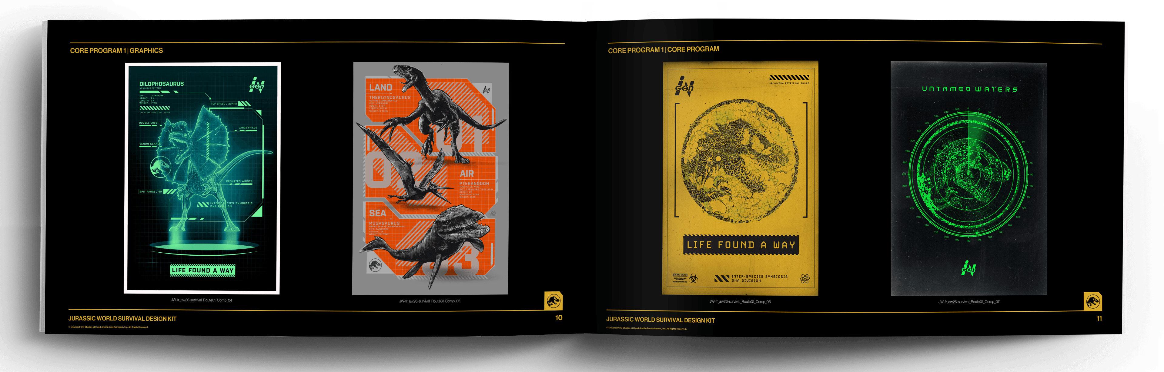
Having previously partnered with Universal on Jurassic trend kits derived from these master guides, the opportunity to work with a new team on the Jurassic World Survival master guide itself was a huge moment. These master style guides act as the global bible for all creative output - spanning everything from packaging and consumer products to patterns, graphics, logos, key art, typography and more.
The scale is vast, requiring a comprehensive and cohesive visual system that can flex across every touchpoint while remaining unmistakably Jurassic World.
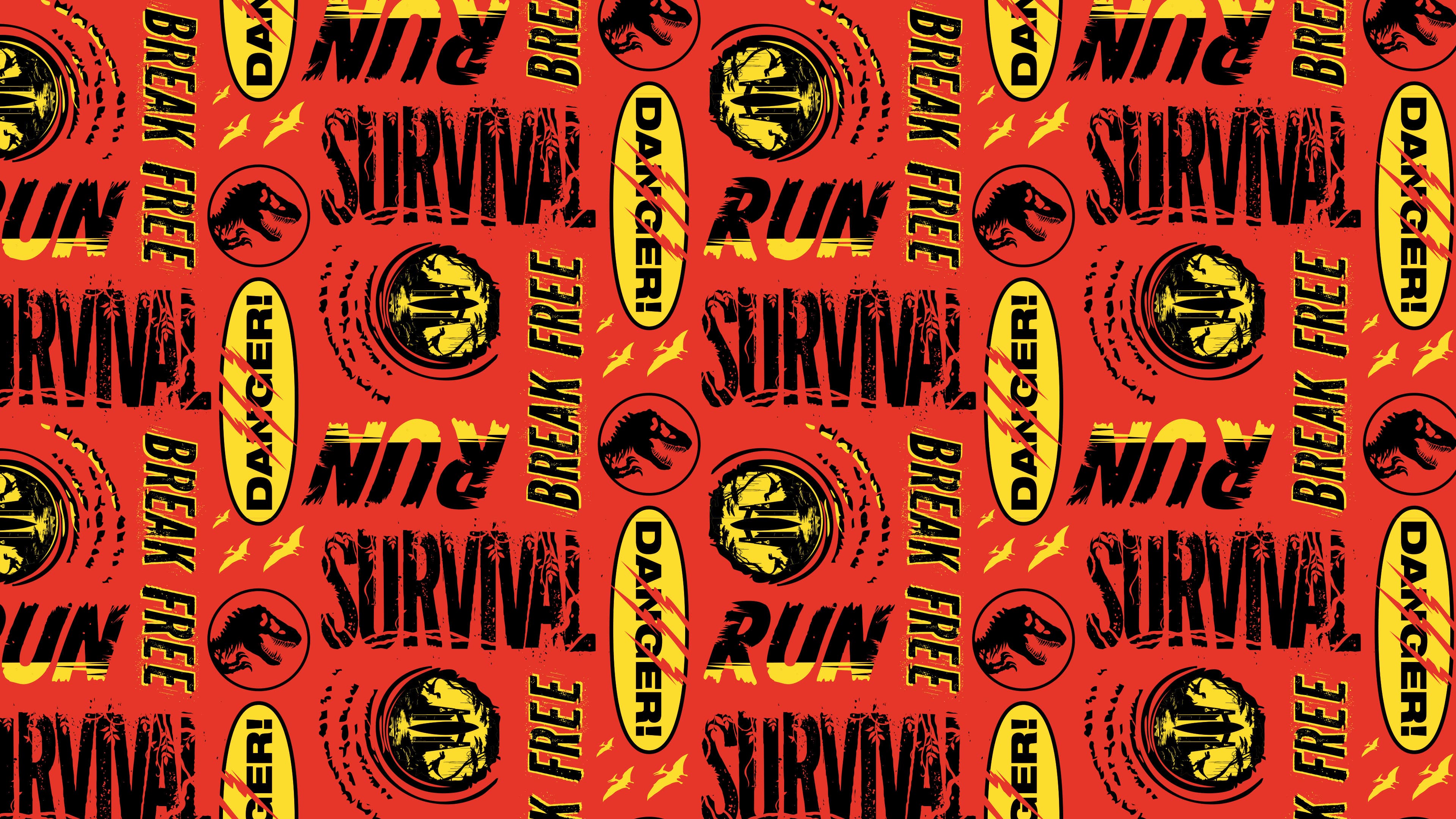
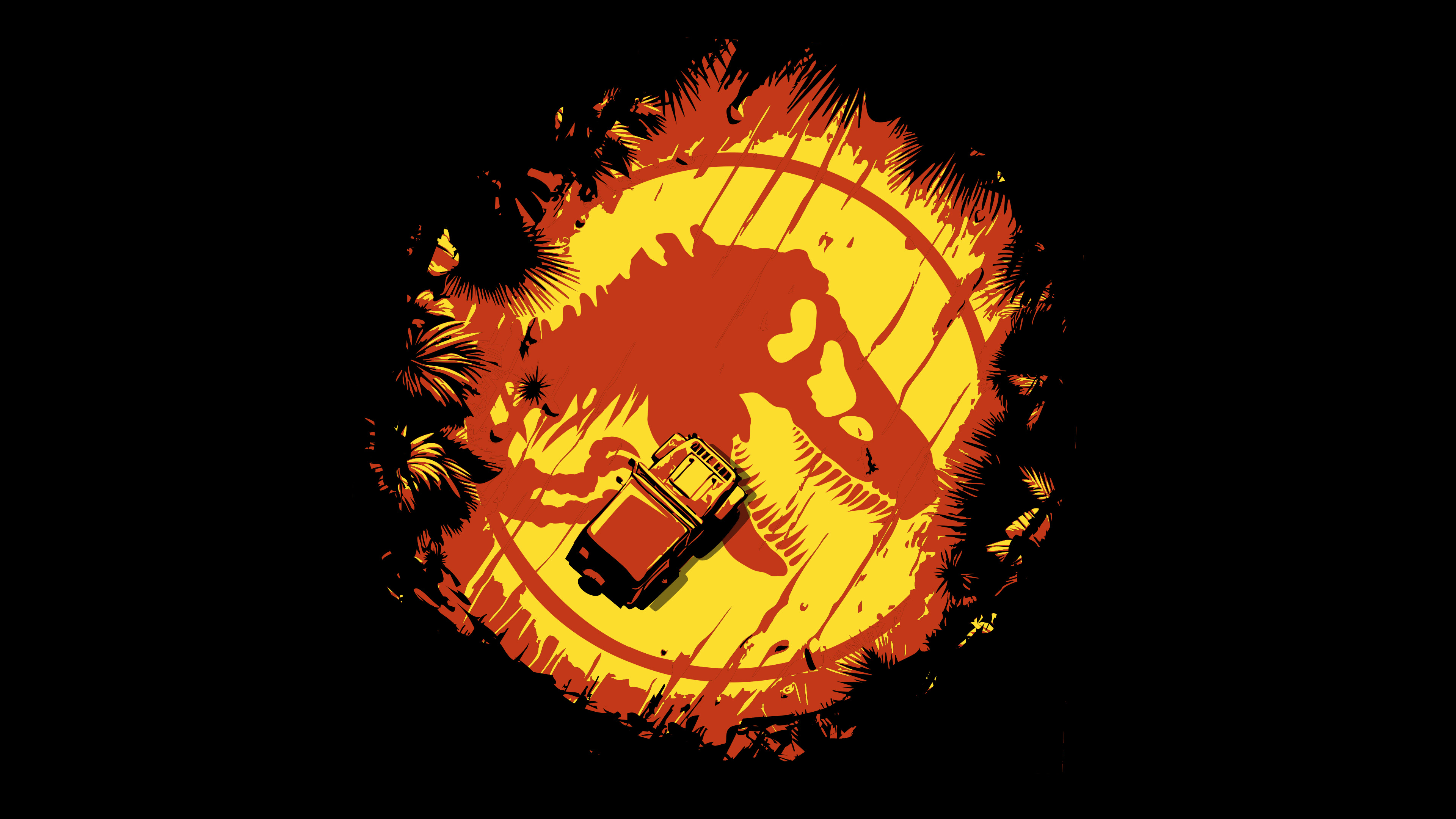
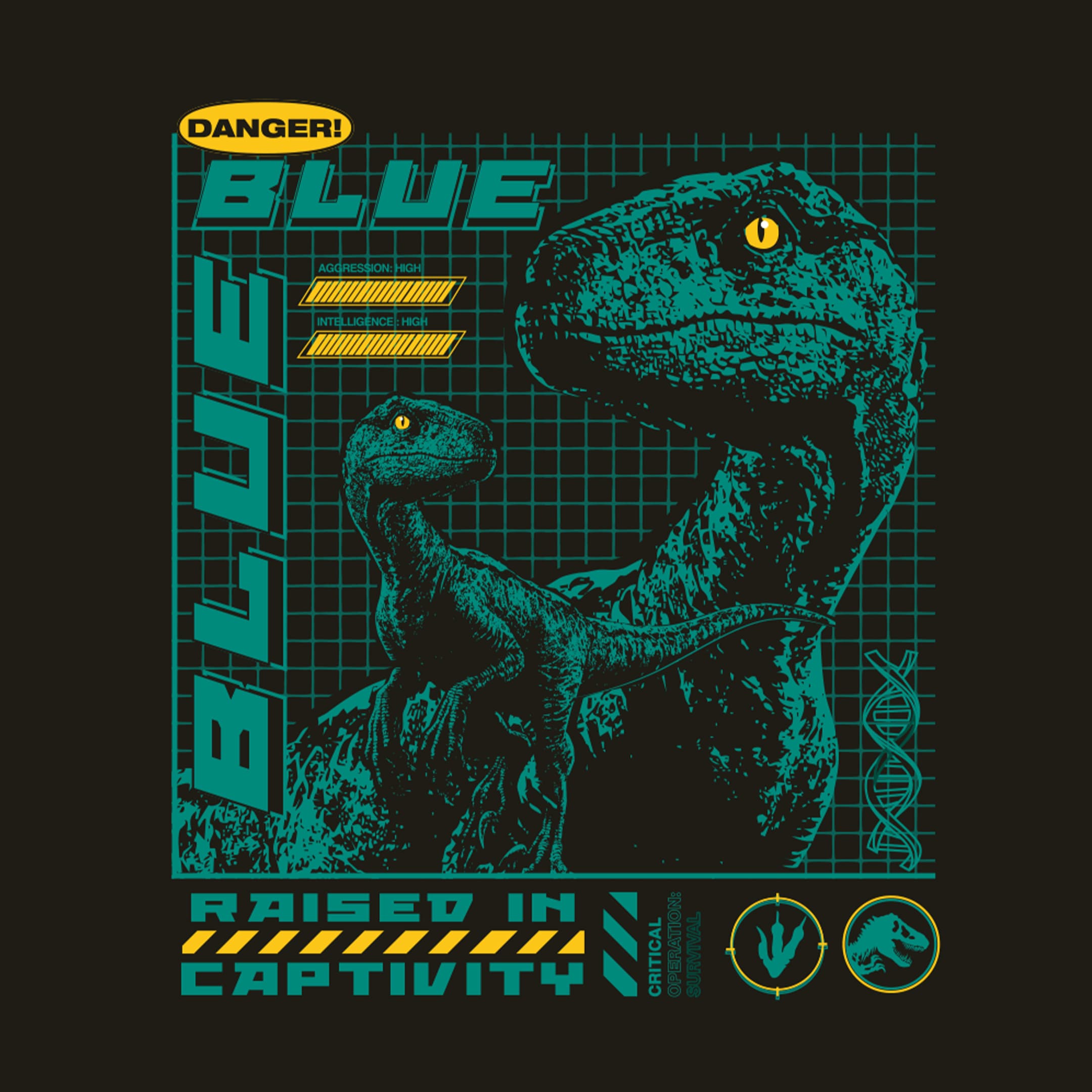
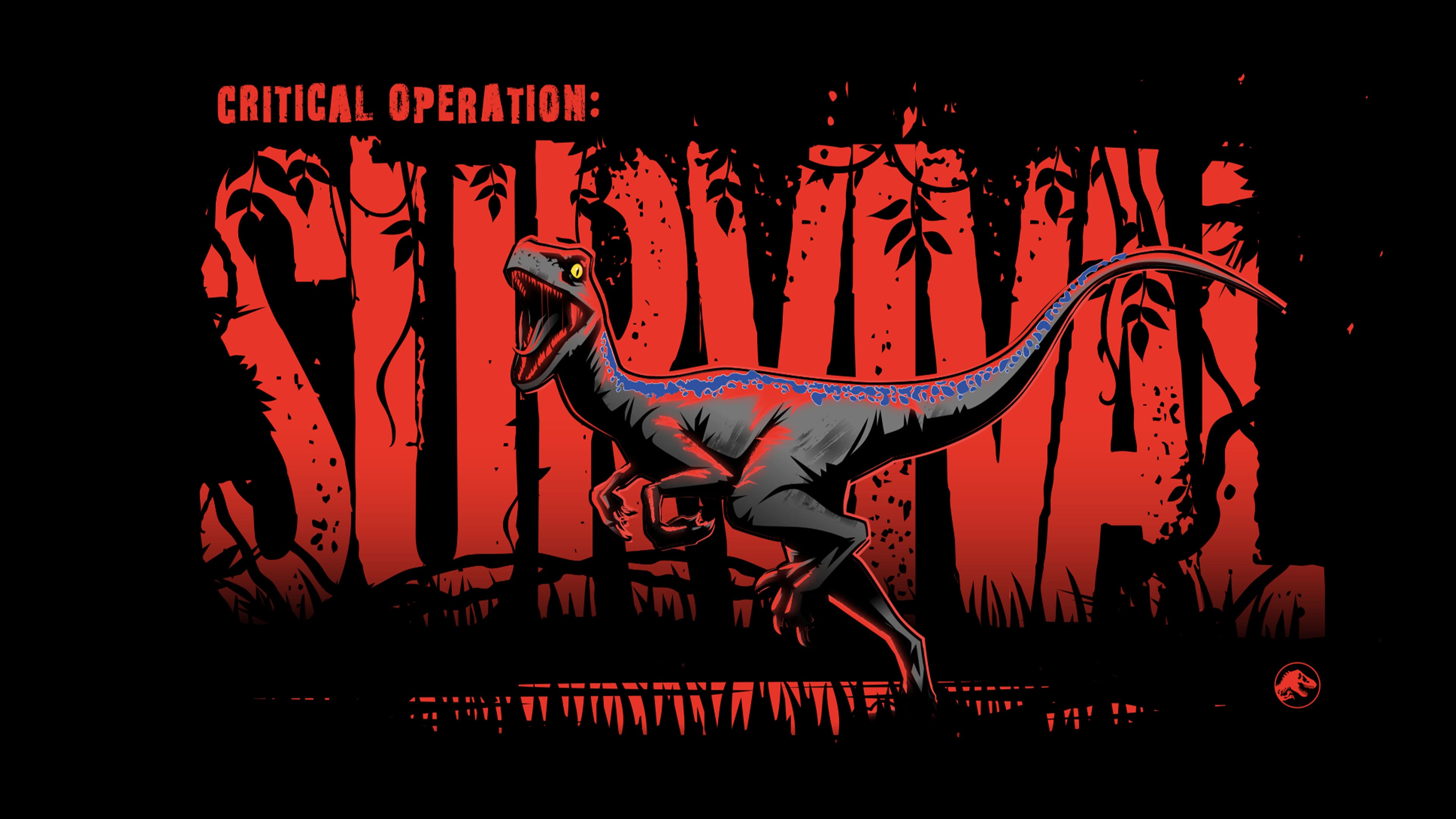
Jurassic World Survival Design Kit centres on a core survival theme - flipping perspective, positioning humans as the hunted, seen through the eyes of predators, and anchor the system through framework built around three core themes - Land, Sea and Air - creating a consistent structure across the entire guide.
Working with the incredibly talented Justin Sola and Faye Woodward, the team developed bespoke illustration, character art and design systems that underpin the full kit.
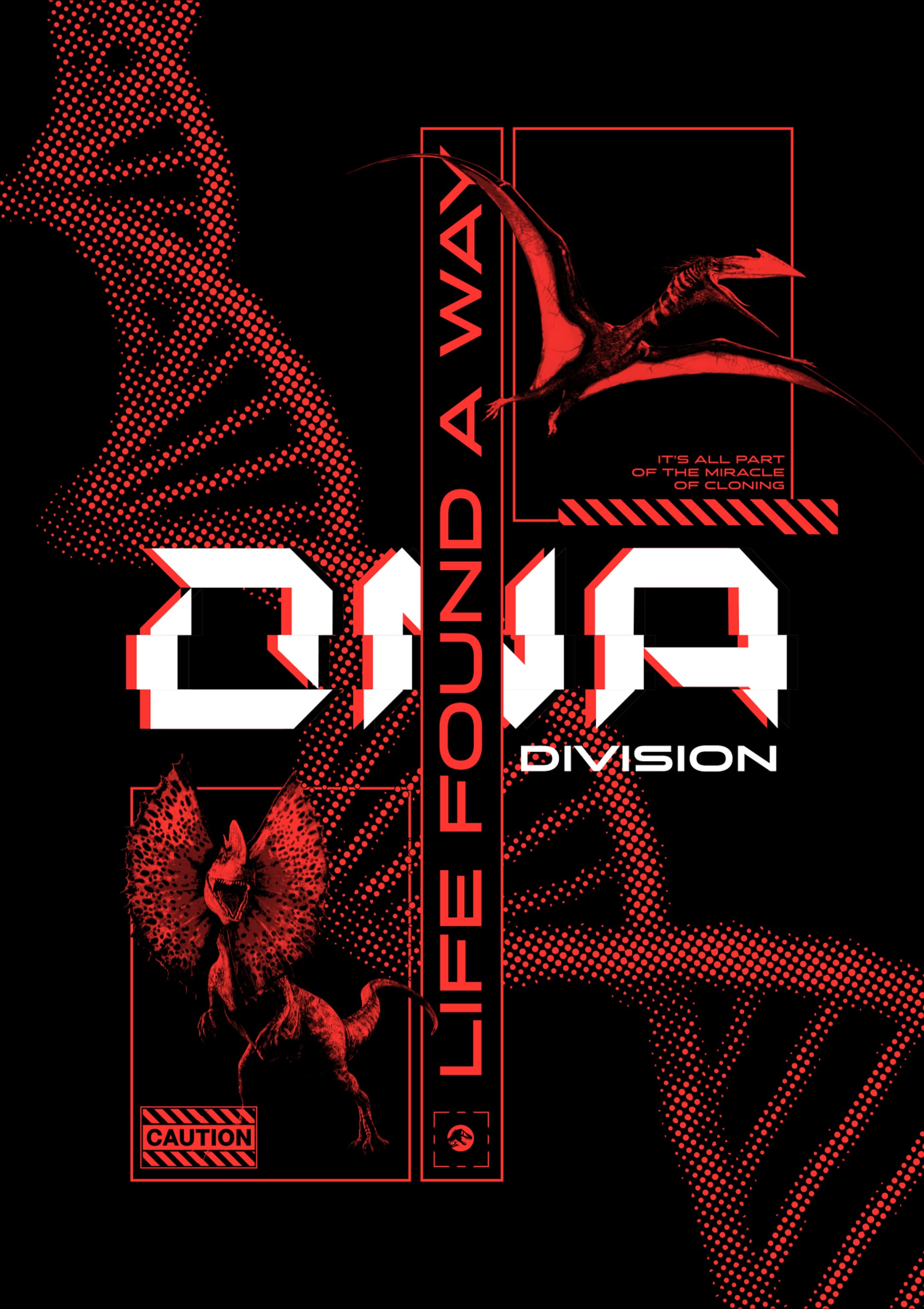
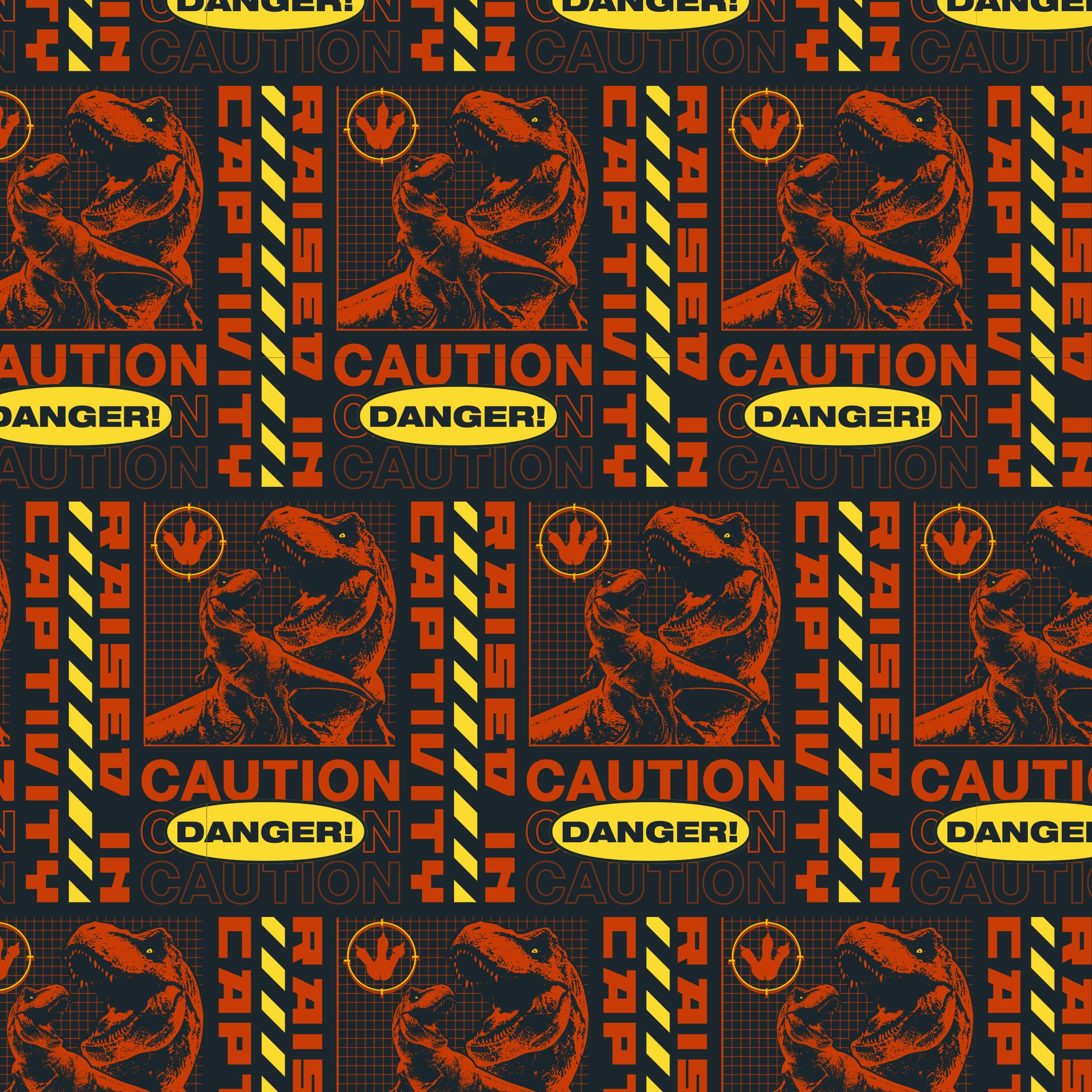
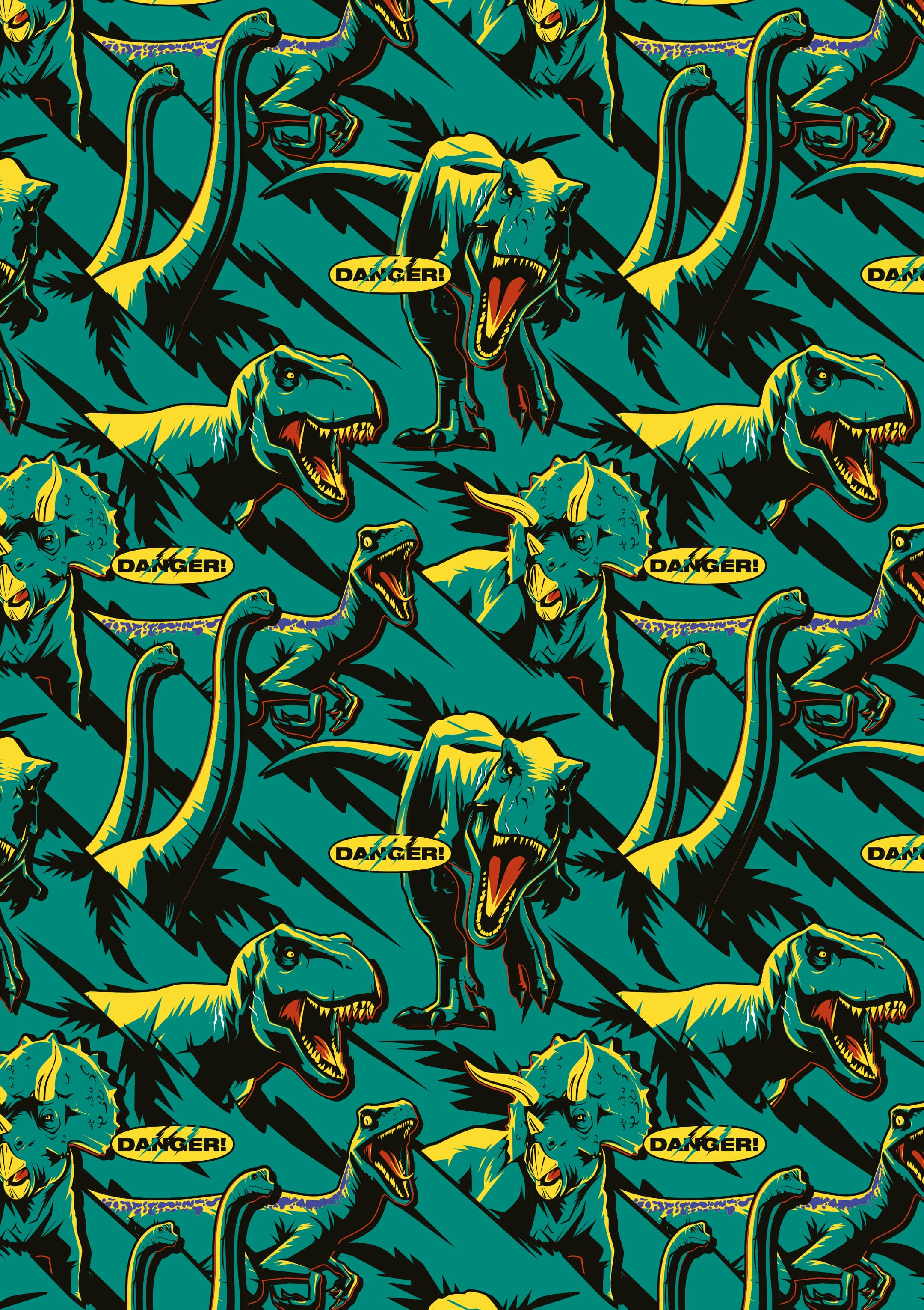
The first of two core programmes leans into a tech-driven, macro aesthetic, blending nature and science, and echoing the DNA at the heart of the original Jurassic Park. With the freedom to draw from across the full film slate, the team combined iconic retro references with newer cinematic moments to create a system that speaks to the entire fanbase. Warning tape stripes run throughout as a unifying device, paired with schematic-style drawings and bold, posterised graphics.
Referencing the petri dish - central to the franchise’s origins - provided a simple but powerful visual mechanic. As always, subtle secondary details add depth: raptor claws form hazard symbols, while looming dinosaur shadows bring tension and atmosphere to key visuals. Coins, maps and bird’s-eye perspectives further enrich the system, using layers as nods to the franchise’s most memorable moments.
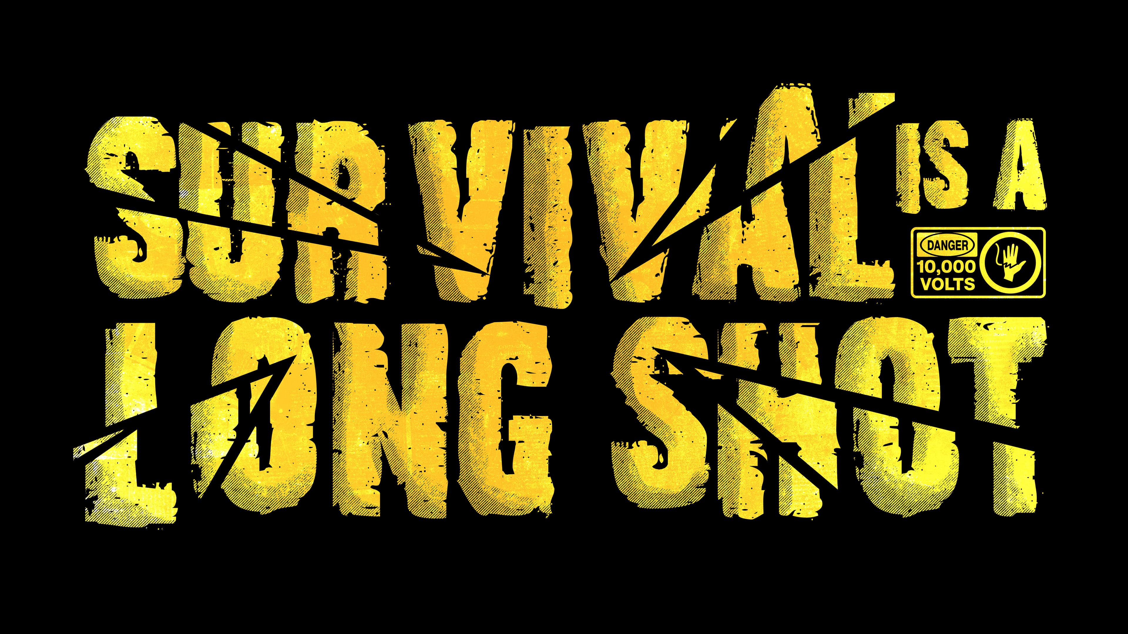
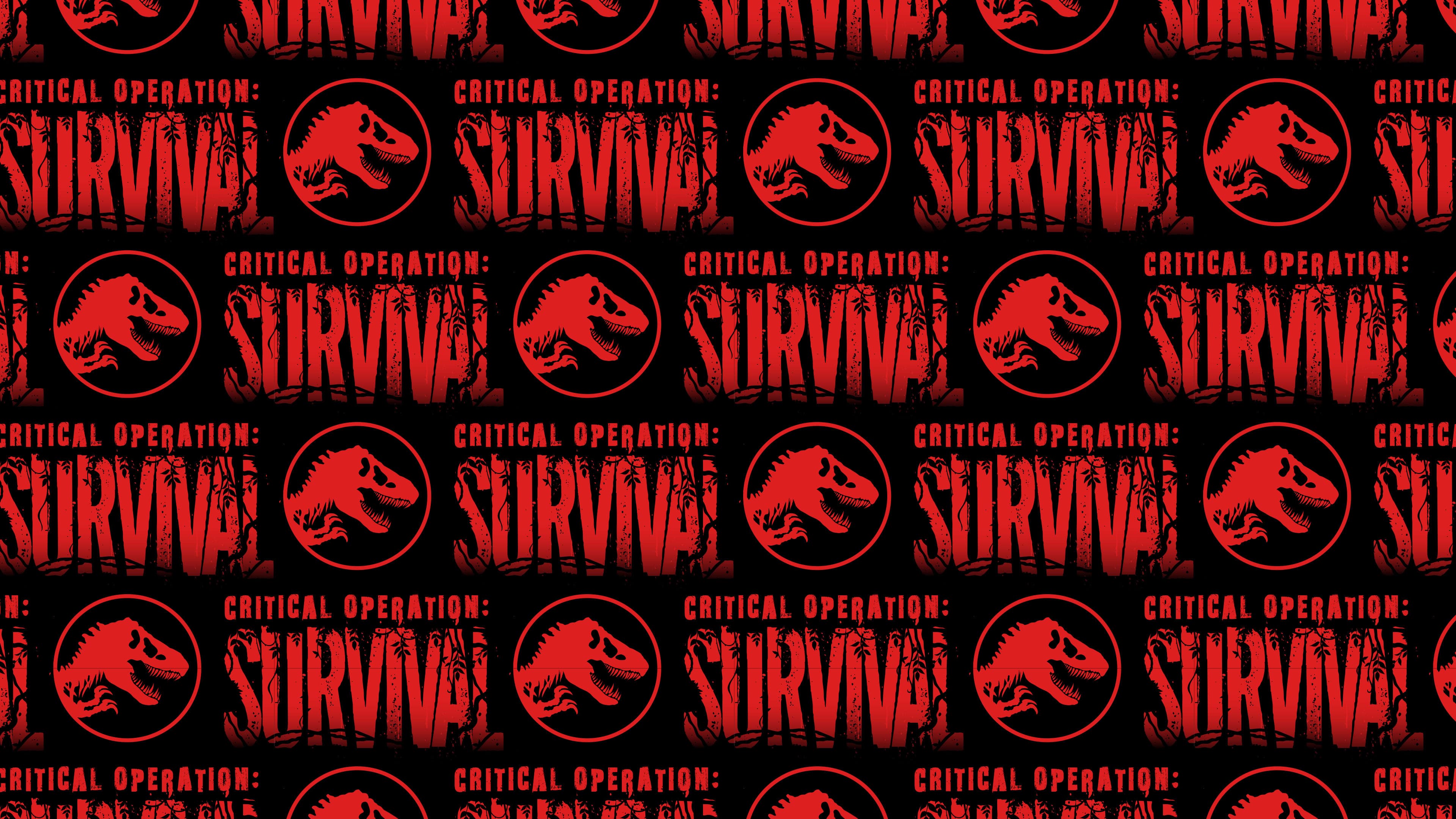
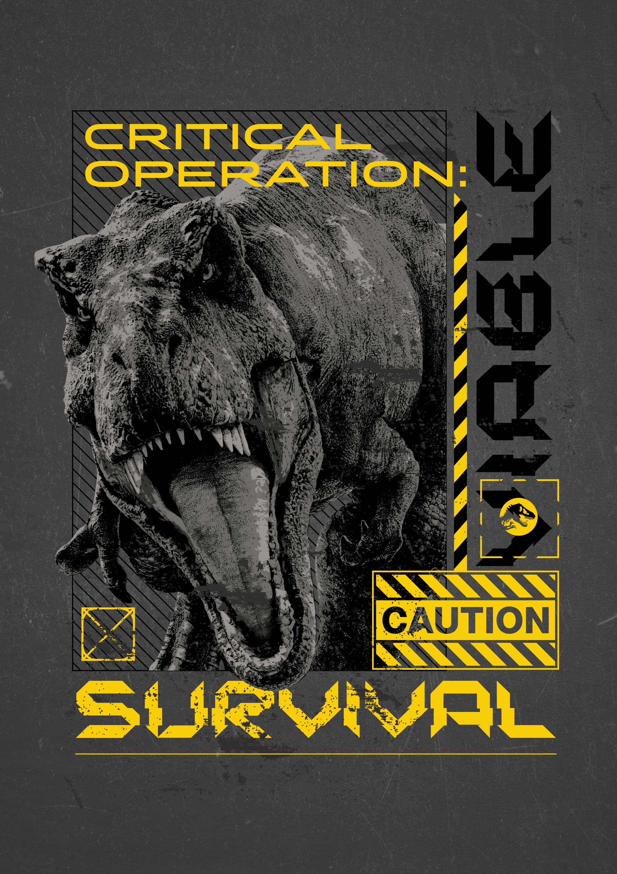
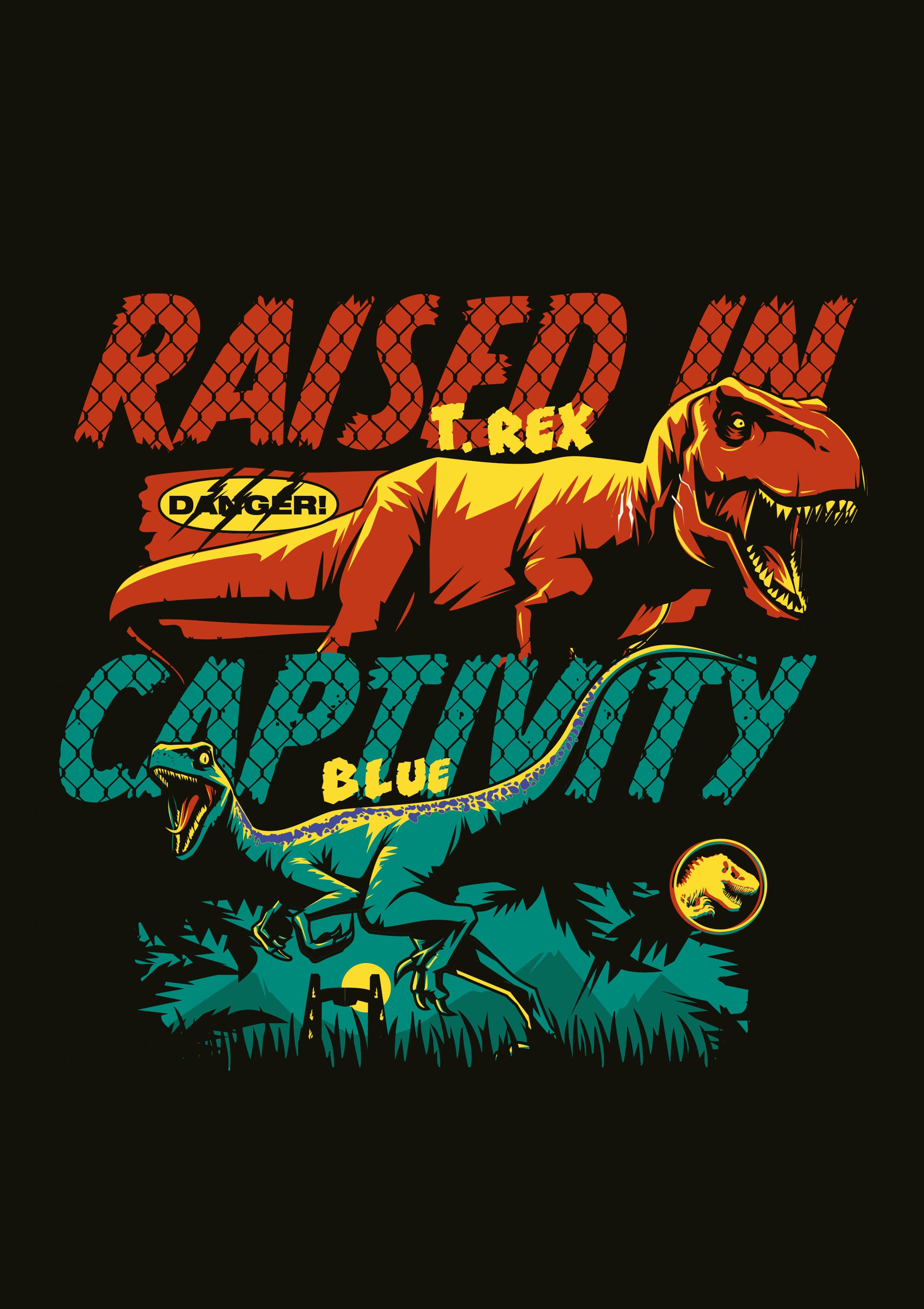
The second programme shifts tone, embracing a more cinematic, B-movie-inspired aesthetic. Here, the work leans into the strength of the brand itself, using tight crops, bold compositions and iconic imagery without over-explaining. With a brand this recognisable, the visuals speak for themselves.
A refined colour palette continues to weave the Land, Sea and Air themes throughout, while iconic elements, from raptors and the park gates to close-up eye details, ensure instant recognition and resonance with fans.
Alongside the master guide, the team delivered a full retail kit. With packaging evolving each cycle, we maintained visual consistency through key devices such as the warning tape motif, while integrating newer film assets to keep the brand current.
The rollout spans in-store displays, FSDUs, banners, stickers and full retail environments, supported by social assets and activity sheets created in collaboration with Fluid’s Digital team.